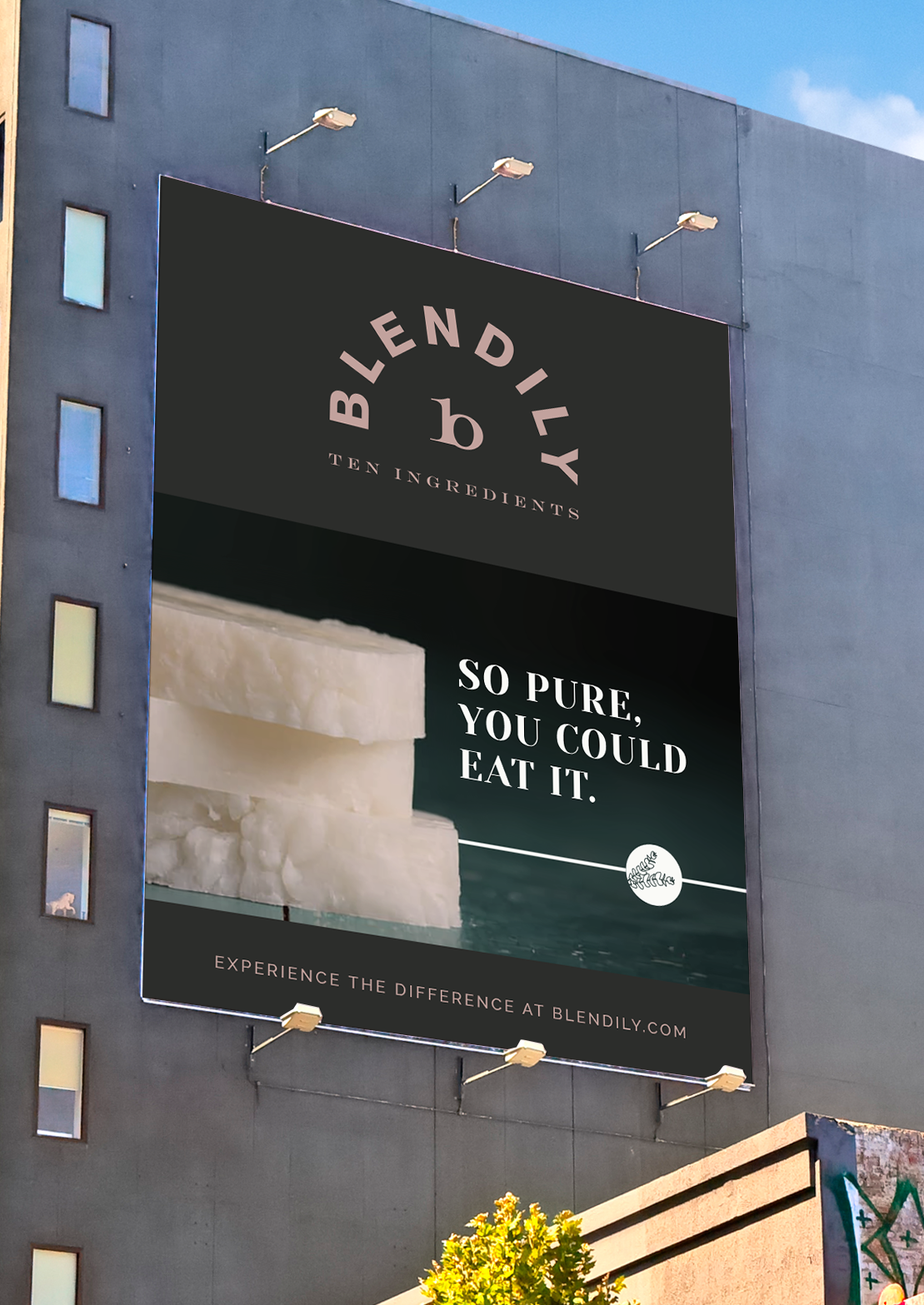
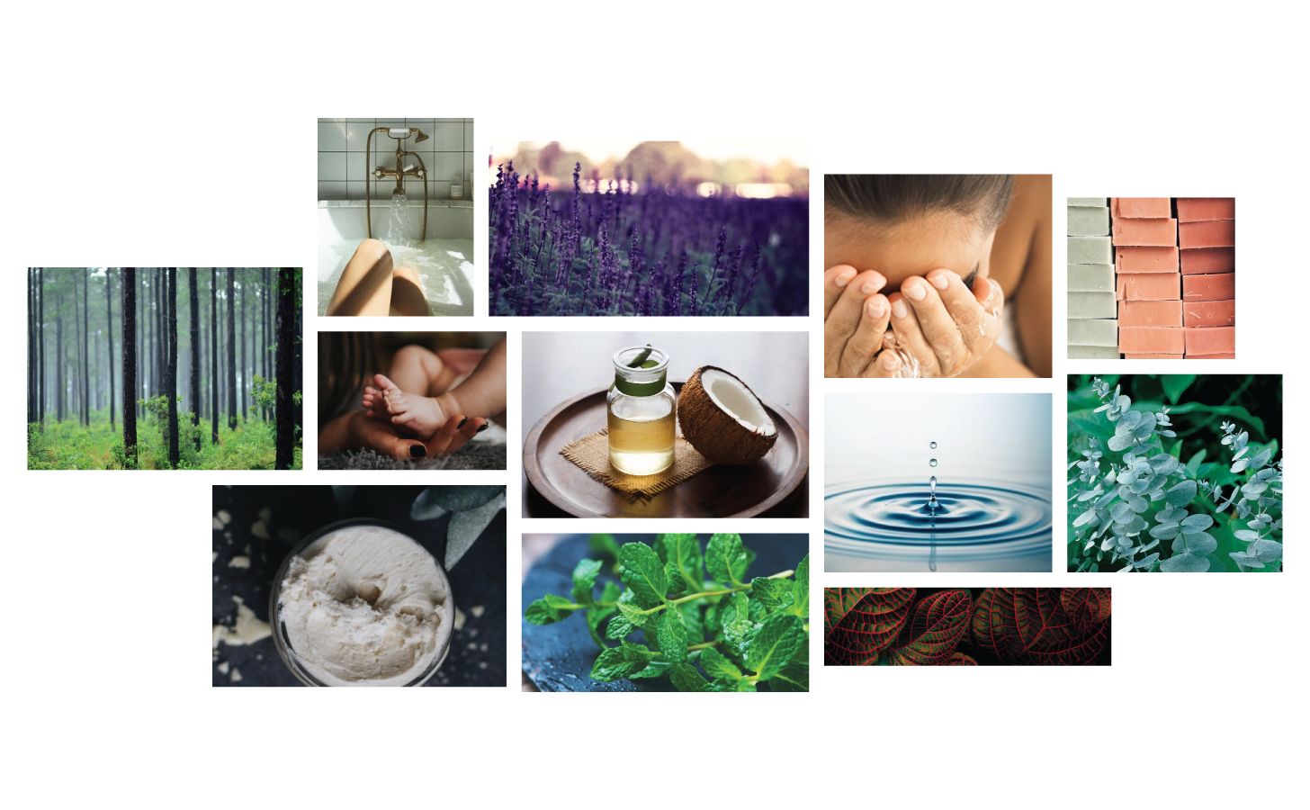
Blendily is an all-natural, organic skincare company producing serums, soaps, essential oils, and balms. Founded by a mother who was concerned about the chemicals her children were coming into contact with in everyday “safe” products, the company is committed to providing high quality products with no more than 10 ingredients per bottle.
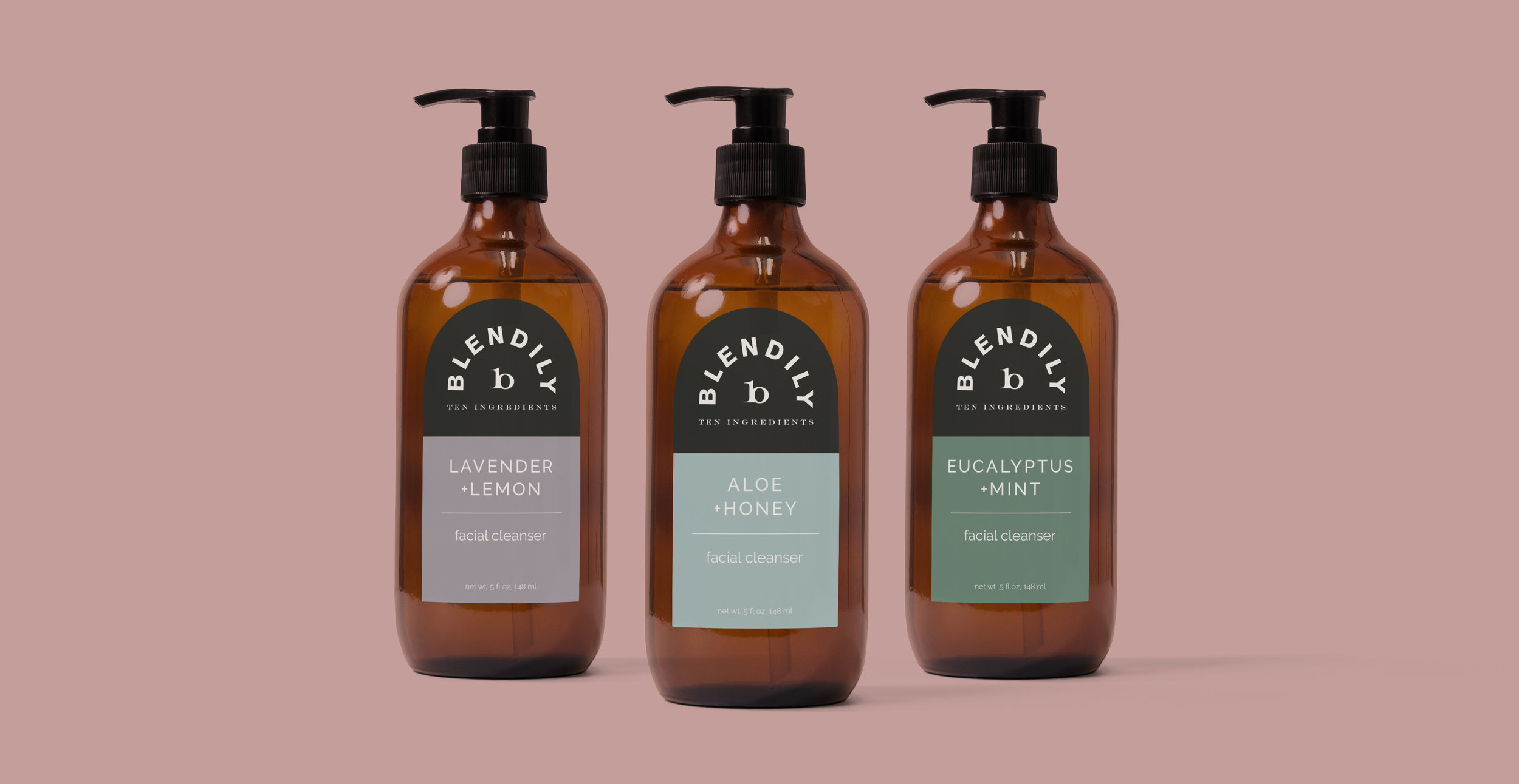
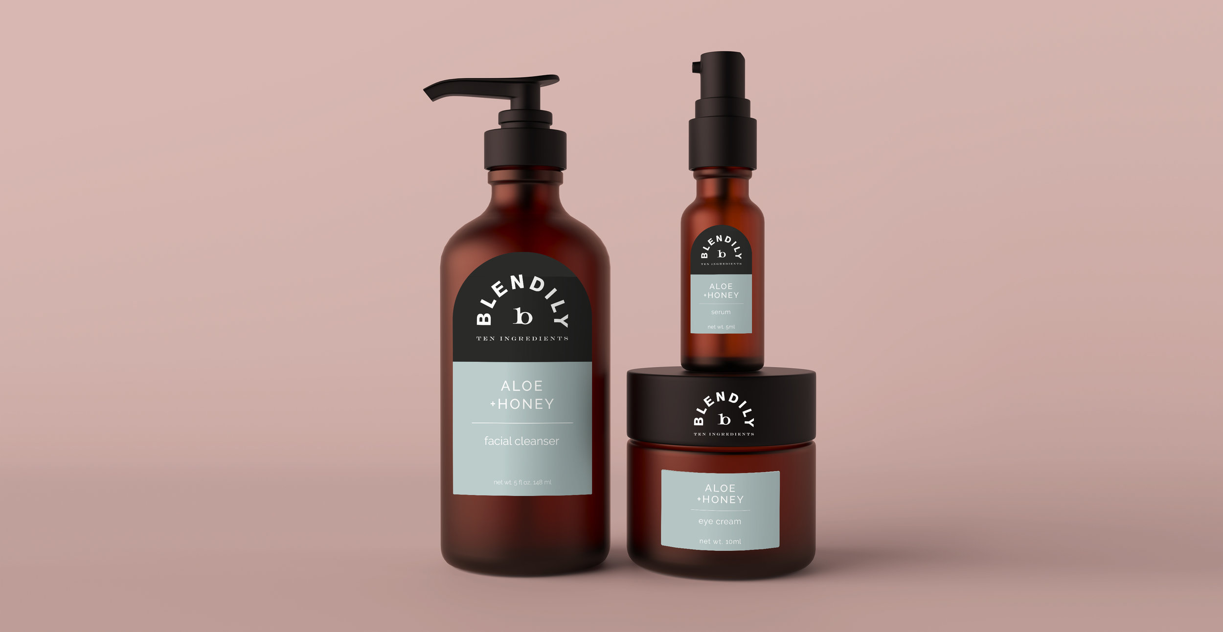
In order to reposition Blendily as high quality, all-natural and simplistic, without feeling stuffy or unattainable, I created a new logo and brand system.


Evolution of the central mark: the central mark “b” is also composed of the number 10 to represent the rule of “no more than 10 ingredients per bottle”. I replaced the zero with the letter o, then brought the 1 and o together and finally optically adjusted them to create the “b”.


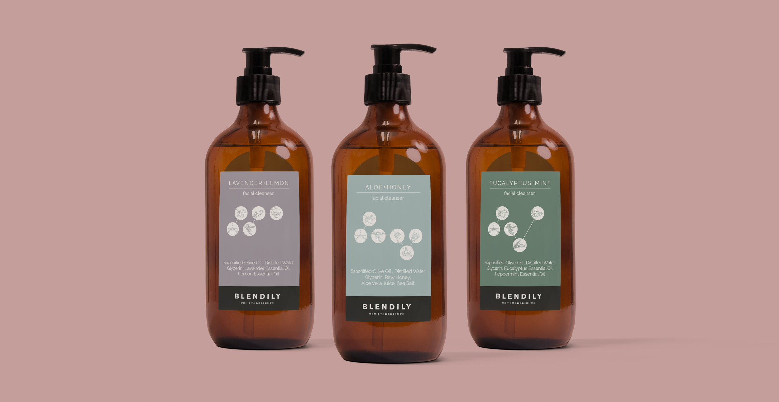
I created the new icon system to allow consumers to easily identify every ingredient. This system becomes essential to educating consumers on the contents of each bottle and the value of each ingredient.